
How inspiring is colour to you?
karen klucowicz • September 25, 2020
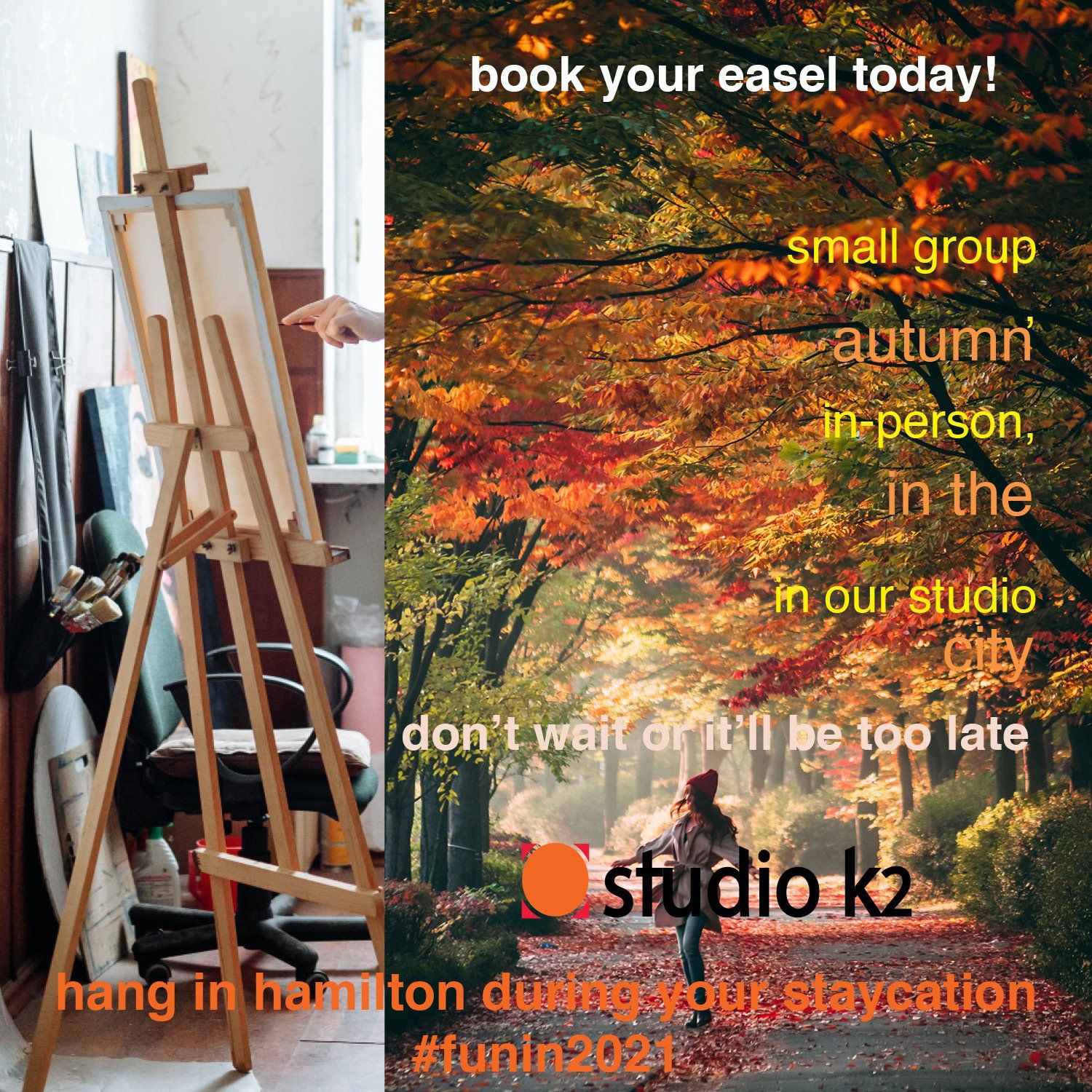
fall in to the beauty nature gifts to us
Colour.
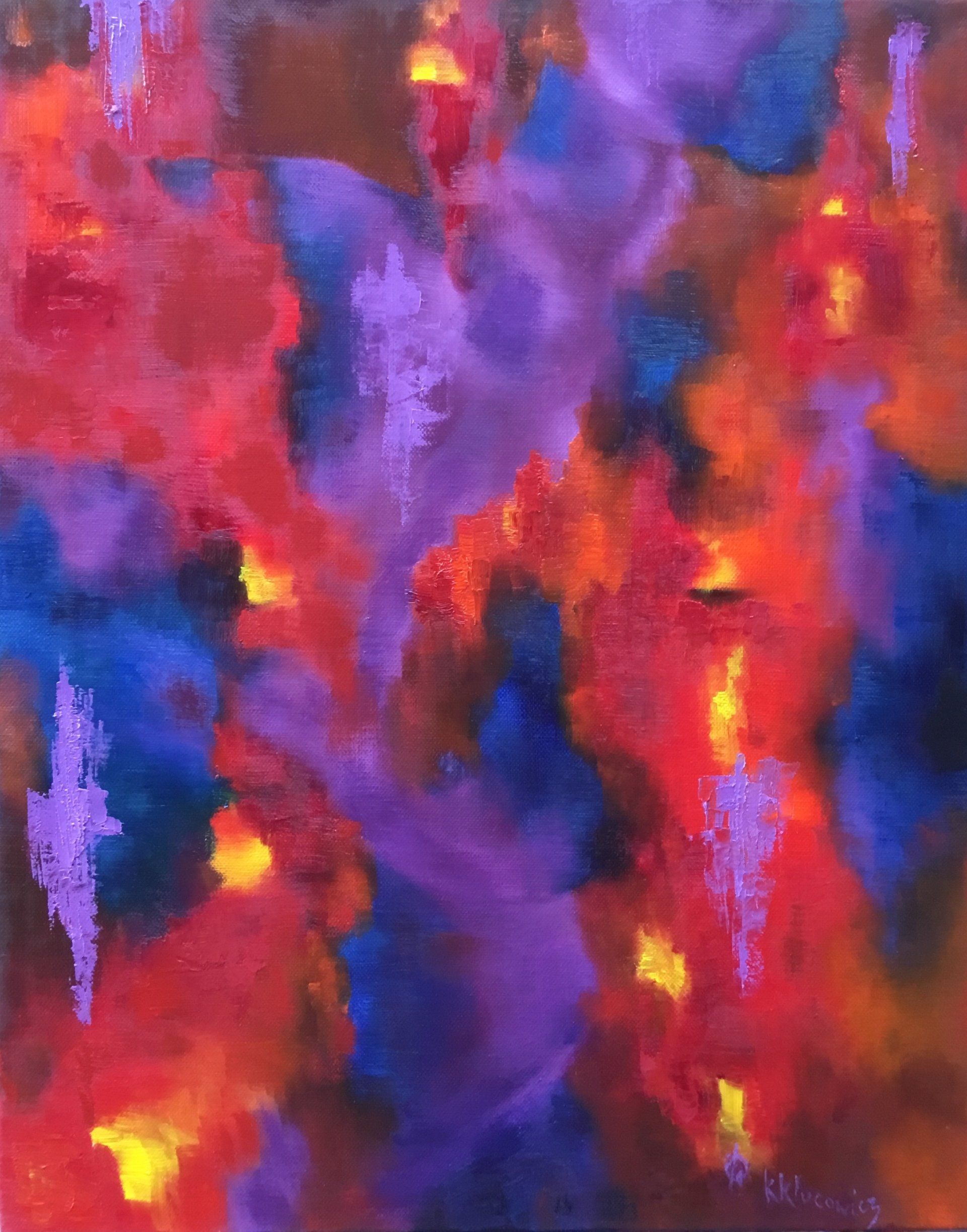
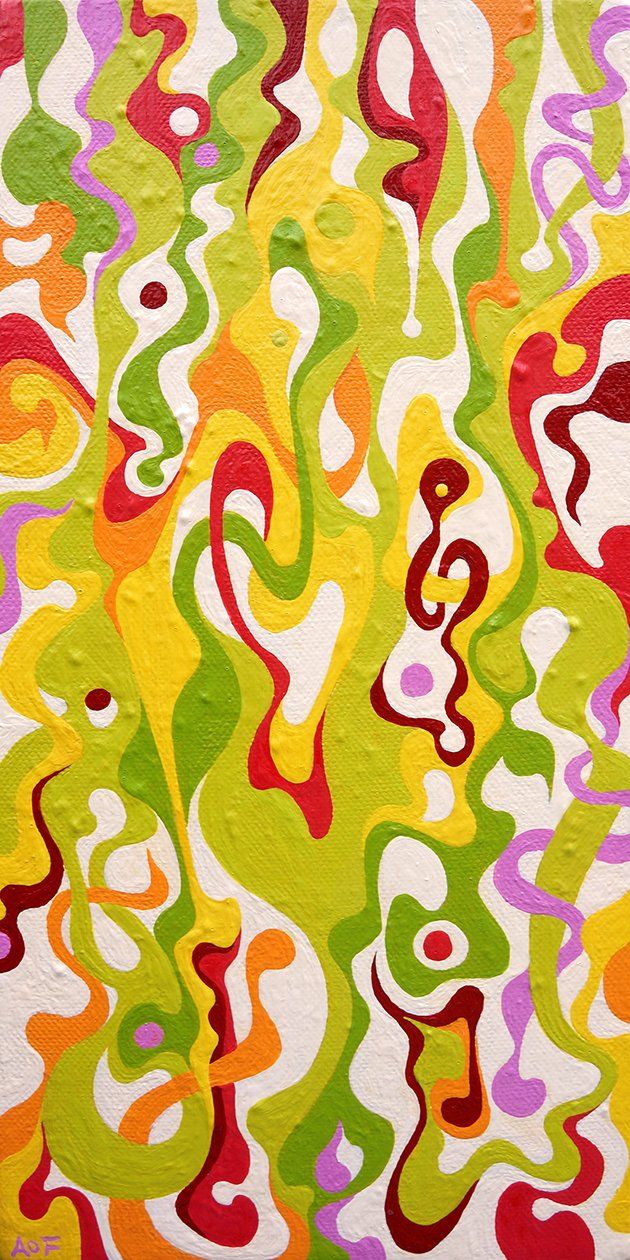
One of my favourite subjects. This season has me reflecting on the impact of colour. There is no better resource to plan, work with or learn from than nature. Sure, my art deviates from it but I have learned the essence of working with colour, juxtaposition and composition by studying natural items — peacock feathers, water, flowers, fruit, animals and human flesh. Here’s a little exercise for you - stare at the skin of your arm for an extended period of time (natural light is best but wherever you are...) As you visually absorb the area, multiple colours will appear to you. While I paint figures in various tones of purple for maximum cultural bridging, there are always other colours within. They give the forms dimension, depth and access to the concepts.
Oh, just a minute, I’m going to put my interior design hat on regarding corporate branding ...
Notwithstanding the ambient noise (music? traffic? machines?), furnishings, fixtures, scents and lighting, the colour of your interiors, beginning with the walls, is critical to your environment.
Offices open to the public (well, as pandemic regulations permit). What do you need to inspire ? calm, excitement, stability, professionalism, formal, informal ?
Offices / production facilities . where most work is not generally open to clients or consumers. What kind of energy do you need to bring to the space and in turn, the team? Peace, very active, multiple levels ?
Offices open to clients or consumers. Do you reiterate your brand identity? A complementary colour to your logo, an accent wall in a colour from the logo, a neutral tone that emphasizes the corporate image?
This is a glimpse in to the importance of colour. Unless you are colour-blind, colour always affects you. Even at that I would suggest that the tints and tones of the grays you see influence your reception to an idea or item. I encourage you to step back and really see the colours around you and your team. If they don’t align with the corporate vision and brand identity and team engagement, it’s time to scheme...
For heaven’s and artists’ sake don’t forget about the art on those walls! You can bring multiple messages in with art from the concept to the colours and the positions they occupy in your space. That’s a whole other post I’ll share with you in the future... for now...on this first weekend of autumn, take a walk or a drive and relish in the glory of natures’ colour as the trees shift to prepare for our winter landscape... You may take away an inspiring palette to reenergize your space, revitalize your personal or corporate brand, and at the very least you will be awed by the beauty surrounding us in these crazy times.
the art of colour
Corporate branding
from the logo and marketing materials to the interior of the space a company occupies, deliver messages in colour as well as words, images, furnishings and fixtures. What do your corporate colours say about your company? How do you influence it presenting it to your team and customers?Oh, just a minute, I’m going to put my interior design hat on regarding corporate branding ...
Notwithstanding the ambient noise (music? traffic? machines?), furnishings, fixtures, scents and lighting, the colour of your interiors, beginning with the walls, is critical to your environment.
interior planes
Retailers...
I’m sure you’ve worked with a designer to ensure optimal presentation of your products. If not, get an expert in and plan your background colours.Offices open to the public (well, as pandemic regulations permit). What do you need to inspire ? calm, excitement, stability, professionalism, formal, informal ?
Offices / production facilities . where most work is not generally open to clients or consumers. What kind of energy do you need to bring to the space and in turn, the team? Peace, very active, multiple levels ?
Offices open to clients or consumers. Do you reiterate your brand identity? A complementary colour to your logo, an accent wall in a colour from the logo, a neutral tone that emphasizes the corporate image?
This is a glimpse in to the importance of colour. Unless you are colour-blind, colour always affects you. Even at that I would suggest that the tints and tones of the grays you see influence your reception to an idea or item. I encourage you to step back and really see the colours around you and your team. If they don’t align with the corporate vision and brand identity and team engagement, it’s time to scheme...
team colours
Take your colour branding a step further. When I present (or work on) art, as when I worked in interior design, I always wear black or white clothing - the idea is to not influence how the colours of the art or the selection of finishes for interiors are received by the viewer. Black and white neutralize and stabilize the surround. Your clothing says something about you but when you’re representing a concept, selling an item or service it should complement and augment the idea with a positive reinforcement. mother nature
and the artist in me is back...For heaven’s and artists’ sake don’t forget about the art on those walls! You can bring multiple messages in with art from the concept to the colours and the positions they occupy in your space. That’s a whole other post I’ll share with you in the future... for now...on this first weekend of autumn, take a walk or a drive and relish in the glory of natures’ colour as the trees shift to prepare for our winter landscape... You may take away an inspiring palette to reenergize your space, revitalize your personal or corporate brand, and at the very least you will be awed by the beauty surrounding us in these crazy times.
season’s greetings :)
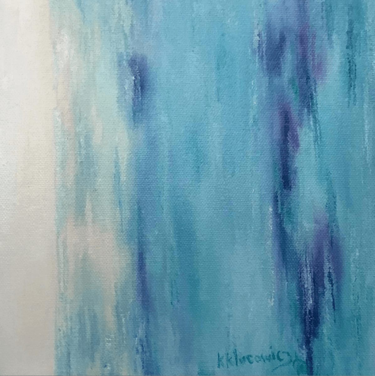
painting by k klucowicz 'privilege' oil on canvas, 16x20"
Artists often work in isolation but require the same kinds of breaks, diversions and work strategies to stay engaged, inspired and connected. These are a few ideas to keep remote team members feeling valued.
Building a team is an art. How the potential candidate fits with existing members and the role they are seeking, ultimately creates your team culture and the success of your business. This tour of the creation of a painting, may afford you the opportunity to look at new ways to interview and hire.
New ways to think of the days of a work week may improve productivity and dispel the myths surrounding some of them (like hump day). Does your typical week have a consistent routine, can you shake it up, should you shake it up? Thoughts like build a unique team culture.
The art that surrounds us is critical to our well-being. Your corporate interior should reflect, project and brand your business as well as your logo does! Inspire creativity in your clients and your team members.
Asking your team how they are, what they think and how it can be improved are critical to building and maintaining a positive team culture, and ultimately, to growing your business. Here are a few helpful methods!
Considering your thoughts and the thoughts of others make us aware – of ourselves, our relationships and communities. Visual artists show us how to do that.
As the season changes to Fall it's time to check in with yourself and your team to make sure you feel balanced so you can reach your full potential.

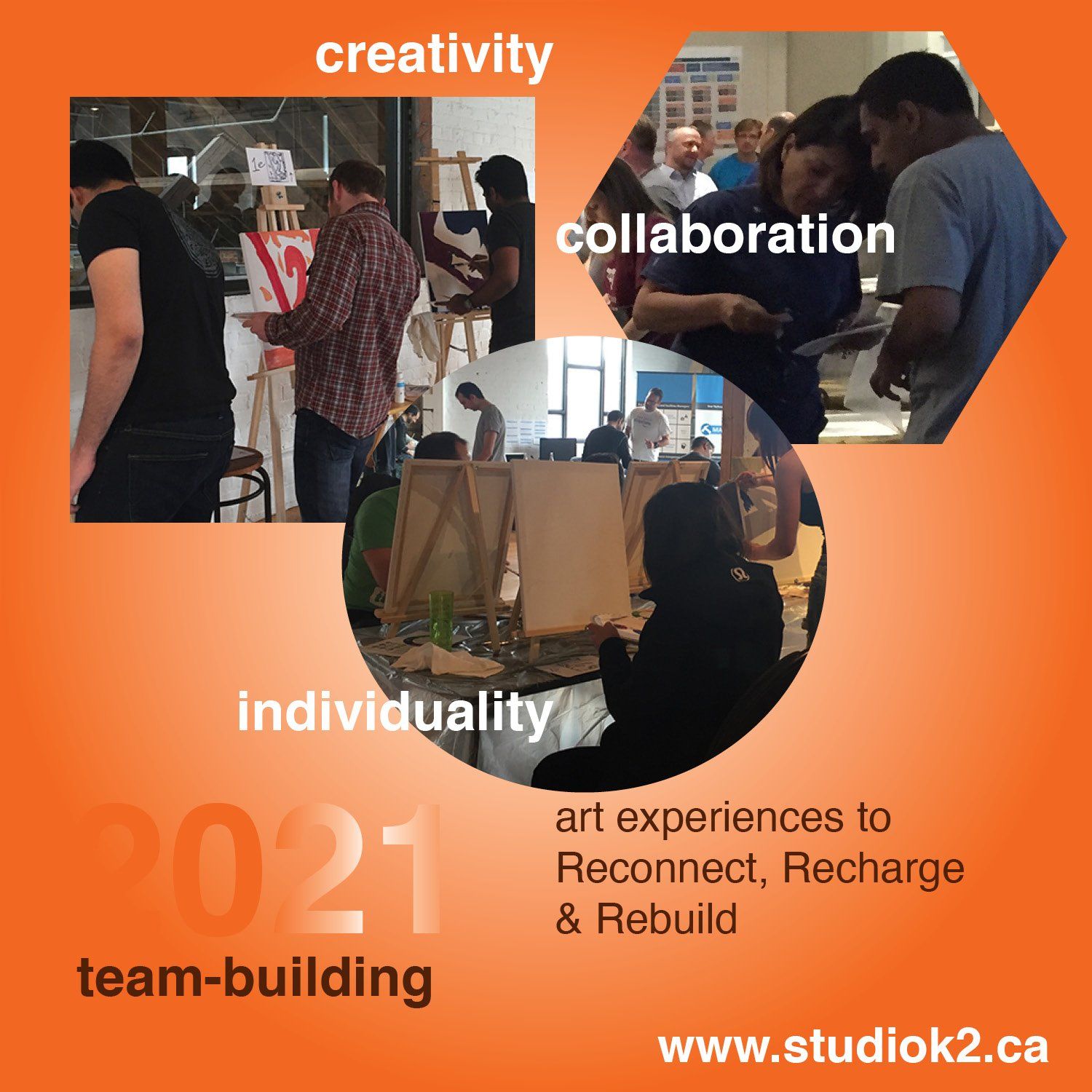
Our teams are in a fragile state. Time to embrace these 3R's for 2021. Reconnect. Recharge. Rebuild. We are all about relationships and this article explores how to check in on your team members and engage them in your business.
Hospitality, customer experience management and customer expectations will aid our economic recovery. How may I help you?
A new program launches in Hamilton to support emerging artists in establishing a career in the arts. A professional development program that builds the business skills of visual artists to run their art business.